Me personally, I feel like that Liquid Glass is just Newmorphism with some glassy-like reflections. I'm really not a fan of it, mostly because it's too transparent.
i didnt wanna say anything but i kinda agree. it looks uncanny valley to me. i remember some1 saying it looks like someone trying to design skeuomorphism when they've only done flat design
xrossmediabar wrote:same people who say 'i hate today's flat design'
patachoo wrote:I don't really have opinions about it personally, that's still better than boring flat design I guess
For me, it's (standard, such as the Newmorphism found on macOS Big Sur) Newmorphism > Liquid Glass > flat.
If I had a choice between Liquid Glass and flat design, I would choose Liquid Glass. Add Newmorphism in to the mix, and I would choose that. While I agree that Liquid Glass is more unique and more pleasing than any form of flat design, flat design has the contrast and accessibility that Liquid Glass lacks.
It's... fine. What gets in the way of it being a truly appealing aesthetic is the fact that you either go all the way with a 3D feel and zero colors, or else you give it color and make it flat again. If they could find a way to make it colorful without sacrificing the glassy look, I would be more on board with it.
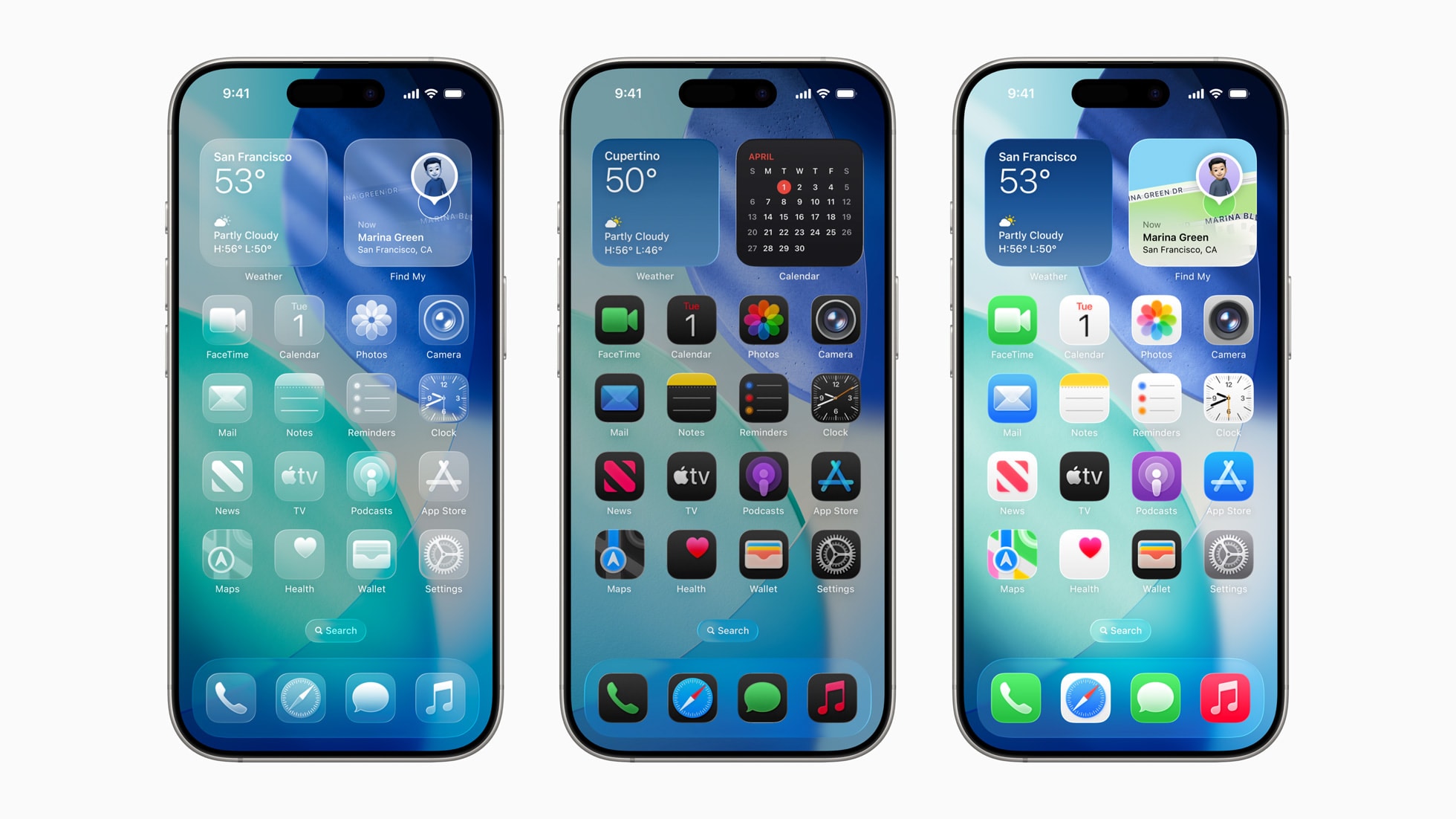
ADDENDUM: If you look at the comparison below, you can see how it especially suffers in dark mode. I'll give Apple points for trying though, because it cannot be easy to make a dynamic skeuomorphic design:
genosad wrote:It's... fine. What gets in the way of it being a truly appealing aesthetic is the fact that you either go all the way with a 3D feel and zero colors, or else you give it color and make it flat again. If they could find a way to make it colorful without sacrificing the glassy look, I would be more on board with it.
Maybe they could go for a tinted glass look where segments of an app icon could be lightly tented to bring in more color?
I honestly preferred iOS before the Liquid Glass update, all the icons were very readable. On Liquid Glass, the transparent mode on the app icons is an absolute nightmare, and the dark mode icons looks ass (just my opinion). What I DO find very cool however is how they managed the reflection effect "shaders" when a transparent element hovers over something else.
But anyways besides the point, this new style feels like a useless gimmick, change for the sake of change, rather than a big improvement. We could probably say the same about Windows Aero when it first came out, but at least there was an actual effort of having readability and accessibility there. On Liquid glass it seems more like an afterthought (for those that tried the beta versions, it's pretty evident).


 Currently busy with Computer Engineering studies