Maybe I'm wrong (I don't have an Iphone), but it still feels minimalistic. The UI doesn't feel "material" enough, it's still a lot more abstract. We didn't get the IOS 6 skeuomorphism back. Liquid glass feels like it's trying to be an in-between design, it's not flat but it isn't skeuomorphic either. It's got more depth than the previous flat design but not it's not glossy or "realistic".
This makes me wonder if liquid glass will actually kill off flat design, companies don't seem more eager to change their whole design philosophy (yet), they're just trying to make flat design a little less boring.
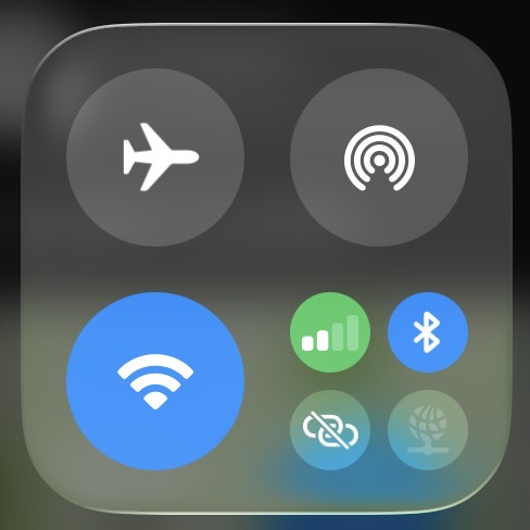
It was sitting on the back of my head for a while, but I believe the reason why it *still* looks off is because the majority of the lighting is at the border, and the glass does not produce a shadow. In real life, glass produces a shadow because it is imperfect at transparency. The buttons lack any sort of shading, lighting, or depth.
Compare with this mockup of a better version of Liquid Glass from KIlo: https://xcancel.com/1000kilobytes/statu ... 6422150576
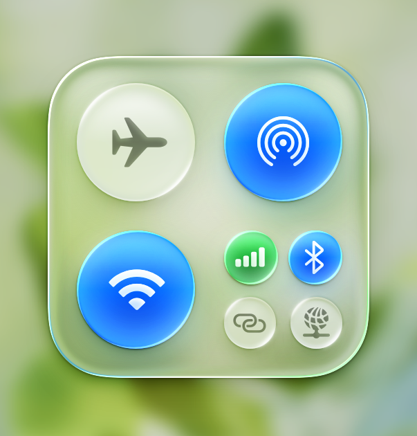
Adding a white tint to the glass allows for more obvious shading within the glass, adding thickness to the glass rather than it being flat and "thin" looking depth-wise. Each button retains the liquid glass effect, with highlights, shadows, and shading throughout.
Last edited by solinus on Sun Dec 07, 2025 8:14 pm, edited 1 time in total.
Maybe I'm wrong (I don't have an Iphone), but it still feels minimalistic. The UI doesn't feel "material" enough, it's still a lot more abstract. We didn't get the IOS 6 skeuomorphism back. Liquid glass feels like it's trying to be an in-between design, it's not flat but it isn't skeuomorphic either. It's got more depth than the previous flat design but not it's not glossy or "realistic".
This makes me wonder if liquid glass will actually kill off flat design, companies don't seem more eager to change their whole design philosophy (yet), they're just trying to make flat design a little less boring.
It was sitting on the back of my head for a while, but I believe the reason why it *still* looks off is because the majority of the lighting is at the border, and the glass does not produce a shadow. In real life, glass produces a shadow because it is imperfect at transparency. The buttons lack any sort of shading, lighting, or depth.
Compare with this mockup of a better version of Liquid Glass from KIlo: https://xcancel.com/1000kilobytes/statu ... 6422150576
Adding a white tint to the glass allows for more obvious shading within the glass, adding thickness to the glass rather than it being flat and "thin" looking depth-wise. Each button retains the liquid glass effect, with highlights, shadows, and shading throughout.
Side by side, the first one looks terrible. The buttons are just as flat as they were before, apple didn't want to commit 100% to changing the design. Did they do this for performance reasons?
Side by side, the first one looks terrible. The buttons are just as flat as they were before, apple didn't want to commit 100% to changing the design. Did they do this for performance reasons?
Possibly, but there's no reason they couldn't at least added drop shadows or subtle shading.
i hate to admit it, but i have to “disable” liquid glass by activating reduced transparency effects. it’s been a real battery drain on my devices. i can see where the critics of windows vista’s performance were coming from now
i hate to admit it, but i have to “disable” liquid glass by activating reduced transparency effects. it’s been a real battery drain on my devices. i can see where the critics of windows vista’s performance were coming from now
personally... i have nothing against it when looking at all the things that went into it. it 100% loses itself sometimes and looks goofy, but when it's good it's good... if that make sense
Me personally, I feel like that Liquid Glass is just Newmorphism with some glassy-like reflections. I'm really not a fan of it, mostly because it's too transparent.
Me personally, I feel like that Liquid Glass is just Newmorphism with some glassy-like reflections. I'm really not a fan of it, mostly because it's too transparent.
liquid glass is just skeumorphism wannabe
i mean, that could probably be explained by the fact that alan dye (head of apple ui design at the time of liquid glass) has only worked on flat design before this project. i think someone here called this by saying that it "looks like an attempt at skeuomorphism but someone's only done flat design" or smth
I love the Liquid Glass because it's showing us what direction they want to go with the interface and design, which could ultimately make a different way of living.
I believe Apple (with their liquid glass update iOS 26) wants to evolve the phone into a piece of glass.